
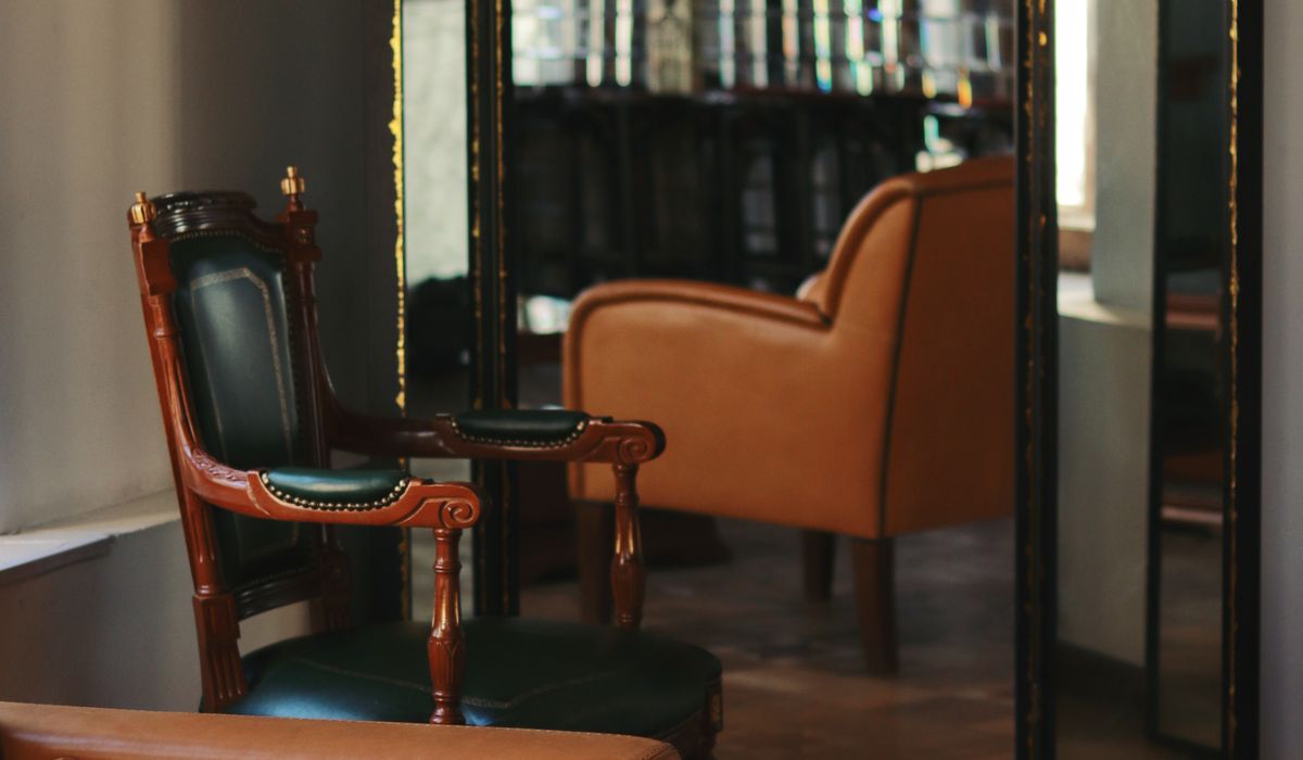
Choosing Paint Colours for a Traditional Sitting Room
Start With the Architecture, Not the Paint Chart
A traditional sitting room already gives you a great deal: cornice, picture rail, deep skirting, a handsome fireplace and perhaps a pair of sash windows. Paint is there to frame those features, not to compete with them. Before you look at a single colour card, spend an hour in the room with a notebook. Note where the light falls at ten in the morning and where it pools at four in the afternoon. Look at the floorboards, the stone of the fireplace and the tone of any curtains or rugs that are staying. These are the fixed notes your scheme has to sit with.
It is also worth resisting the urge to repaint every surface in the same colour. Period houses were rarely painted that way. Original schemes mixed a deeper tone on the walls with a softer shade on the woodwork, and a slightly chalky finish overhead. That variation is what gives a room a sense of age rather than a showroom flatness.
Read the Light Before You Choose
Light is the single biggest variable and the one most often ignored. A north-facing sitting room receives cool, indirect light all day, so colours with a grey or blue base will read colder still. A mid-grey that looked elegant in a shop can look distinctly bleak at home. Warm the scheme with ochre-based neutrals, soft biscuit, clay or a muted sage with a yellow undertone. These bounce what little warmth there is around the room.
South-facing rooms are far more forgiving. They carry a deep green or a strong muted blue without going gloomy, and in fact need a certain depth to hold their own against all that light. East-facing rooms are bright and cool in the morning and flat by afternoon, so treat them as north-facing rooms with a little more courage. If the room is used mainly in the evening, judge your samples under the lamps you actually use. A warm bulb will flatter earthy colours and muddy anything with a strong violet base.
Three Palettes That Rarely Disappoint
Traditional sitting rooms reward colours drawn from the natural pigments older houses were built around. Three families do most of the work.
- Deep greens. From a soft olive through to a dark forest or a blackened green, this is the most reliable colour for a period sitting room. It sits beautifully against wood, brass and aged leather, and it makes a white cornice sing. Use the darkest versions on the walls where the light is good, and keep the ceiling a shade or two lighter so the room does not close in above you.
- Warm neutrals. Think stone, parchment, oatmeal and the paler end of the greige spectrum, but always with a yellow or red base rather than a blue one. These are the colours you can live with for fifteen years. They make an excellent backdrop for pictures and dark furniture, and they are the safest choice if the room is small or badly lit.
- Muted blues. Not the bright blues of a coastal scheme, but those softened with grey or green: powder, duck egg, slate and a dusty navy. A muted blue is particularly good in a north-facing room, where it reads as calm rather than cold, and it pairs handsomely with the greens above.
Test Samples Properly
This is the step that separates a good scheme from an expensive mistake. A two-inch dab on the wall tells you almost nothing. Instead, paint a large sample — a sheet of lining paper or a piece of A2 card, two coats, thoroughly dried — and fix it to at least two walls, one of which receives direct light and one that sits in shadow. Leave it there for a week. Look at it in the morning, at midday, at dusk and with the lamps on. Watch how the colour behaves beside the fireplace and against the woodwork.
A few practical points. Buy tester pots in the exact finish you intend to use, because sheen changes a colour noticeably. Paint samples on white card rather than directly onto an existing wall, so the old colour does not distort your judgement. If you are choosing between two shades, test them side by side and leave the room for ten minutes before returning — the first glance is usually the truthful one. Once you have decided, note the name and the finish somewhere sensible, on the back of a switch plate or inside a cupboard door, so you can match it in five years' time.
Ceilings, Woodwork and the Finishing Touches
Walls are only part of the picture. A brilliant white ceiling will look harsh above a deep green, so choose an off-white with a touch of grey or cream, in a flat or matt finish that hides the unevenness of old plaster. Woodwork — skirting, architraves, dado rail, window frames — is best in an eggshell, which wipes clean and gives a low, soft sheen that catches the light. Traditional rooms look well when the woodwork is either a shade lighter than the walls or a shade darker. Identical tones throughout can look a little thin.
Do not forget the radiator, the fireplace surround and any built-in cupboards. Painting them into the wall colour makes them recede, which is often the neatest solution in a small room. Finally, allow for two full coats over a suitable primer, especially if you are covering a strong colour or old distemper. It is the least glamorous part of the job and the part that decides how the room will look for the next decade.
tag: Interiors

Oliver Hartley Author
Mention the specific gift or gesture, explain how you will use it and close with warm regards. Handwritten notes carry more weight than digital messages.
YOU MAY ALSO LIKE
How to Write a Thoughtful Thank-You Note
Aug 7
10Clean with saddle soap, condition the leather and replace worn hardware. A little patience can bring a quality piece back into daily use.
read more
Restoring a Vintage Leather Briefcase at Home
Aug 5
10A pot of loose-leaf tea, a walk without headphones and a few pages of a novel can restore calm amid a demanding schedule.
read moreMenswear
-

ERRIC CATONA
Choose wider wales for casual outfits and finer wales for smarter settings. Pair with knitwear, brogues and a wool overcoat for autumn walks.
May 19, 2016 at 5.12 pm
Reply
ERRIC CATONA
Pomades suit slick styles, clays add texture and creams offer a natural finish. Start with a small amount and build gradually.
May 19, 2016 at 5.12 pm
Reply -
ERRIC CATONA
Consider face shape, brim width and material. A felt fedora works for cooler months, while a Panama suits summer weddings and holidays.
May 19, 2016 at 5.12 pm
Reply
Grooming
Your email address will not be published.